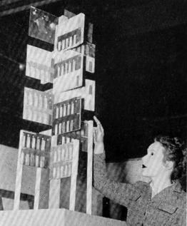
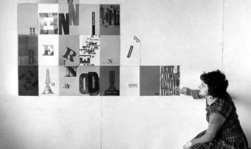
12/2022 photo ID update: might not be Elsa.
Could be Juliet Kepes, Elsa's classmate at
the School of Design in Chicago.
Elsa Kula at the first SIU department of design exhibition
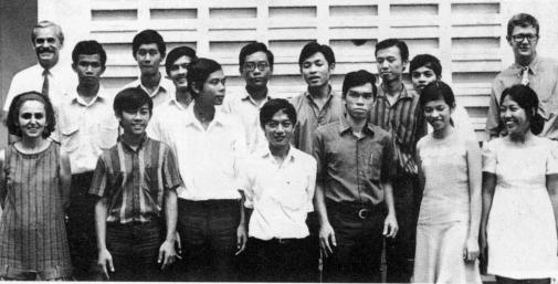
Elsa Kula (front row far left), Davis Pratt (back row far left) and Tom Kachel (back row
far right) with students in Thailand.
Elsa Kula
Excerpts from
SHARED VISION:
The Second American Bauhaus
By Al Gowan Al Gowan: Elsa Kula was the only female faculty member in Design from 1956 until 1970. She continued to teach until her retirement in 1978. She was a diminutive woman whom I had read about in a design magazine that had featured her group, 27 Chicago Designers. Her reputation—Elsa and her bag of tricks—referred to the playful techniques and images in her work. When I decided to return to SIU in 1959, I brought my portfolio to a campus visit in the spring. Elsa had joined the faculty, and I was bit nervous as she lit a cigarette and flipped through my book, blowing smoke through her nose and occasionally grunting. When she finished, she closed and zipped my portfolio, and gave me three words: “You DRAW well.” I got the message. She thought I had a lot to learn. That fall I was in Elsa’s class on the second floor of Morris Library, where she had us work with foundry and wood type. This was the first time I had
touched real type. I'd been working
as a designer for four years, in St.
Louis and in Nashville. On layout
approval l'd send out to a type
house for proofs, which came back
perfect, with any typeface I needed.
The small selection of battered
type Elsa had did not impress me.
But one day Len Gittleman, a
visiting lecturer who had studied at
the Institute of Design, showed a
film of the ID's platen press running
by itself set to a modern classical
sound track. I fell in love. Within
two years, I had my own platen
press and won awards with it in Art
Directors Club shows. In 1964 I got
my first full time college teaching
job at Indiana University because I
knew letterpress printing. It was the
same week Bucky Fuller appeared
on the cover of TIME magazine.
Thank you Elsa. Moving backwards
enabled my career to leap forward.
Bruce Lierman: As a
sophomore, I spent a lot of time
with Elsa Kula. She presided over
the media and graphics course,
which met every day. Appearing
half asleep, cigarette hanging from
her fingers, talking slowly, she
dished out the projects, and the
critiques. She was a formidable
legend. Block printing, woodcuts,
found objects, making printing
plates out of almost anything we
could find, photograms,
typography— the list of media we
experimented with was endless.
In fact, she smiled frequently, but it
was more a matter of tone of voice
than change of expression. Some
said she was foul-mouthed, but to
me she just made sure she spoke
in language a college student could understand. She was definitely flexible in her class management. Once one of the students
was falling asleep on a spring afternoon, a pretty apparent breach of conduct when there were only about eight students in the
class. Following her string of epithets, she reached into her purse, pulled out a bottle of medication, then handed a pill to the
offender. “Here! Take this!” Whatever it was, he didn’t doze through the rest of the afternoon. And he talked a lot more.
She would teach us the rudiments of technique for printmaking, justifying type, working with inks and presses, and then we were
on our own.
She judged the result, but she also judged the process. She believed as long as you developed the ability to critique yourself
and to keep after your goal, you would eventually succeed. It didn’t really matter too much what the initial efforts looked like. To
her, they were steps on a path. I believe she was patient with us because she was never fully satisfied with her own work, like
most other successful artists.
My recollections of Elsa Kula are probably kinder than my attitudes about her when I was her student, but she did teach me a lot.
Years later, after I had graduated from SIU Design, started grad school, and was in the Air Force, I got a month’s leave to go
back to school to work on my graduate degree. We needed a place to live, and I asked a few friends still on campus if they knew
of a place my wife and I could stay for a month. The Pratts were in Thailand, and through their daughter Jessica, we rented their
house.
The house was an Asian oasis in Carbondale, Illinois. The entire yard was wild with bamboo, the house completely invisible on
its small lot behind green walls. It was small, spare, and a gallery for the work of the Pratts and their friends. It was an austere,
contemplative place, and just as they left it.
There was one feature I’ll never forget. The house had futon beds on the floor, which was fine with us. But above the master bed,
looking out at the opposite wall, was a large, stuffed moose head. Have you ever awakened in the morning, become conscious
to find you’re staring up at the goatee of a bull moose? It took some getting used to, but it was also the kind of improbable,
idiosyncratic notion that brought me back from the rigid, disciplined world of the Air Force to the imaginative, personal world of
the SIU design department. Oddly, this world seemed the more sane and authentic of the two.
Robert Doty: I took a course in typography with Elsa Kula. We got an introduction about how you set type by hand, and then
we critiqued the final results. Or, a teacher would show us how to use the darkroom and then tell us to go take pictures. We were
encouraged to do most of the critiques ourselves. From the outset, we learned from the failures we made and why.
Jim Nugent: Davis Pratt was my favorite. He was the most rational of the three. Grosowsky was an enthusiast, Roan was
cryptic and intuitive, while Elsa was more of a craftsperson.
RR
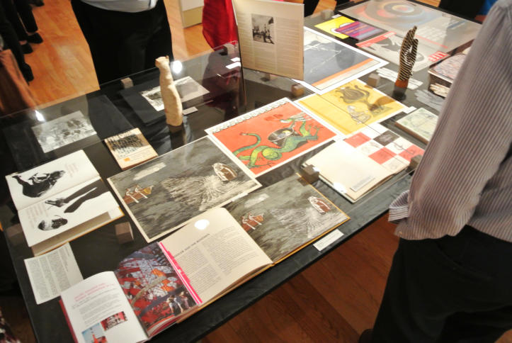
Color woodcut illustrations influenced by by Elsa Kula & Davis Pratt’s visit to Japan. On exhibit during the Chicago
Bauhaus Exhibition at the Ukrainian Institute of Modern Art in Chicago, Illinois (September 2013)
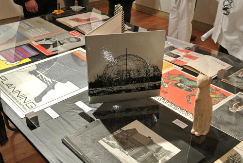
Chicago Society of Typographic Artists (STA) exhibit invitation by Elsa Kula. Silver “record jacket” with high contrast picture
of SIU design department basketry-tensegrity dome. On exhibit during the Chicago Bauhaus Exhibition at the Ukrainian
Institute of Modern Art in Chicago, Illinois (September 2013)
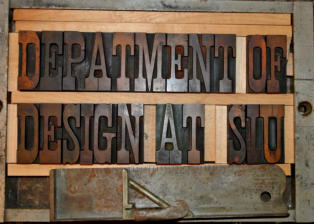


Design at Southern Illinois University


